English
 Deutsch
 Slovensky
 Français
 Español
 Português
 Polski
The GPS navigation trend-setter Sygic starts rolling with a new user interface. It's far more than just changing colors and contrasts. Sygic comes up with a better arrangement of all data in the navigation to be more visible and intuitively customizable, maximizing the simplicity of the user's experience. Improved menu, driving mode upgrade, and new elements are boosting Sygic's capability of an intelligent assistant on the road. They are all available for Android, and iOS will follow soon.
In Sygic GPS Navigation, each new version significantly improves its UX/UI. The dedicated Sygic development team consistently gathers user feedback and stays updated with the latest design trends to drive continuous enhancement and innovation. The changes in color schemes and information layout are purposeful and aimed at providing a more user-friendly experience. These changes allow drivers to optimize their navigation experience while reducing the need for frequent screen interactions.
One of the most noticeable changes in Sygic GPS Navigation is the relocation of the search bar. It now resides at the bottom of the screen, incorporating favorite addresses for easy access, and it remains readily available throughout the navigation journey. Additionally, the map layers button, including a satellite view option for comprehensive searches, is now conveniently accessible.
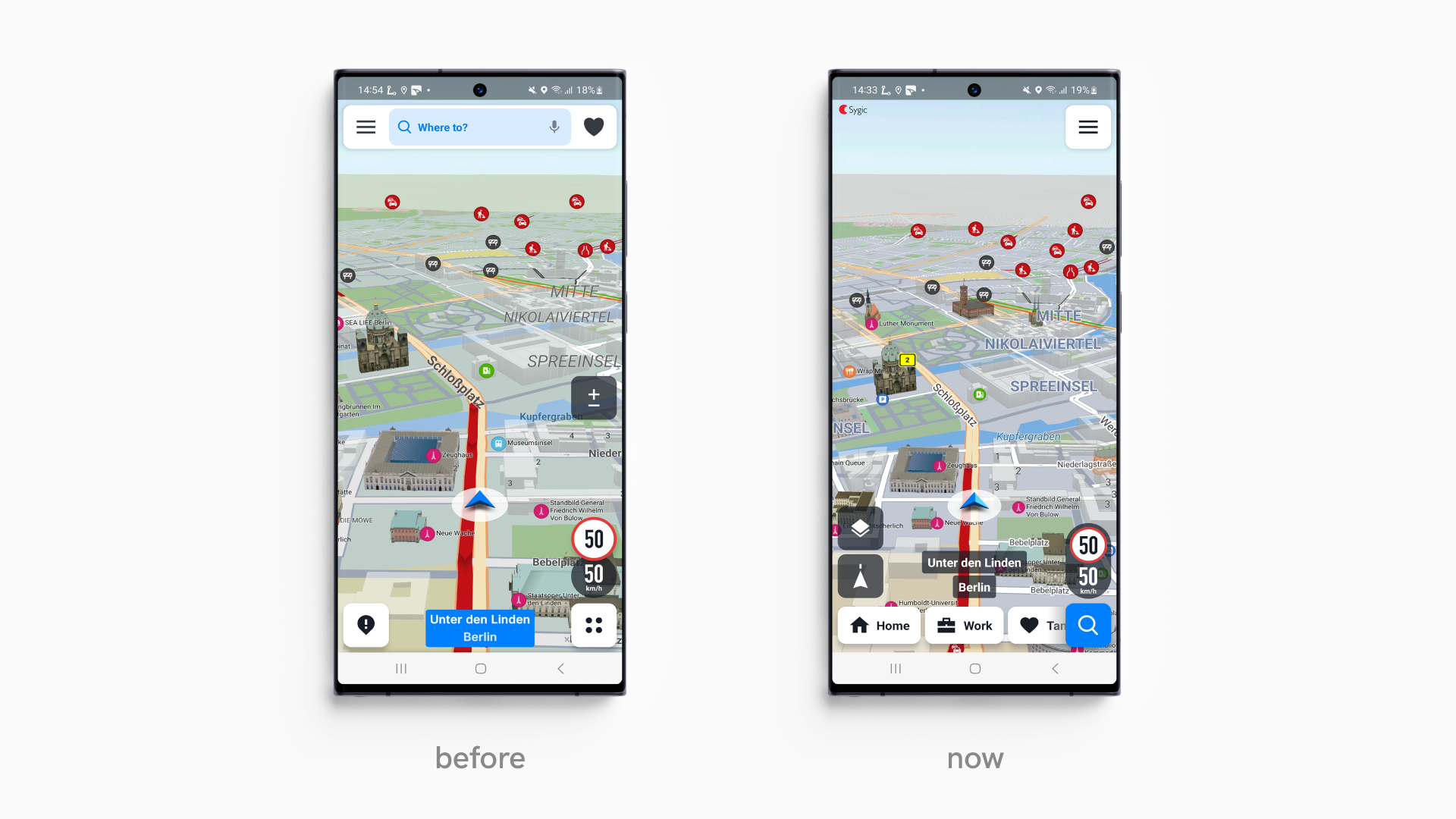
Upon opening the app, users enter the explore mode, which seamlessly transitions to the free drive mode with a move. Once the driver sets the destination and chooses the route, a single tap on the navigation screen reveals a suite of buttons: volume control, map zoom, route overview, and a conspicuous, attention-grabbing yellow notification bubble for reporting road incidents.
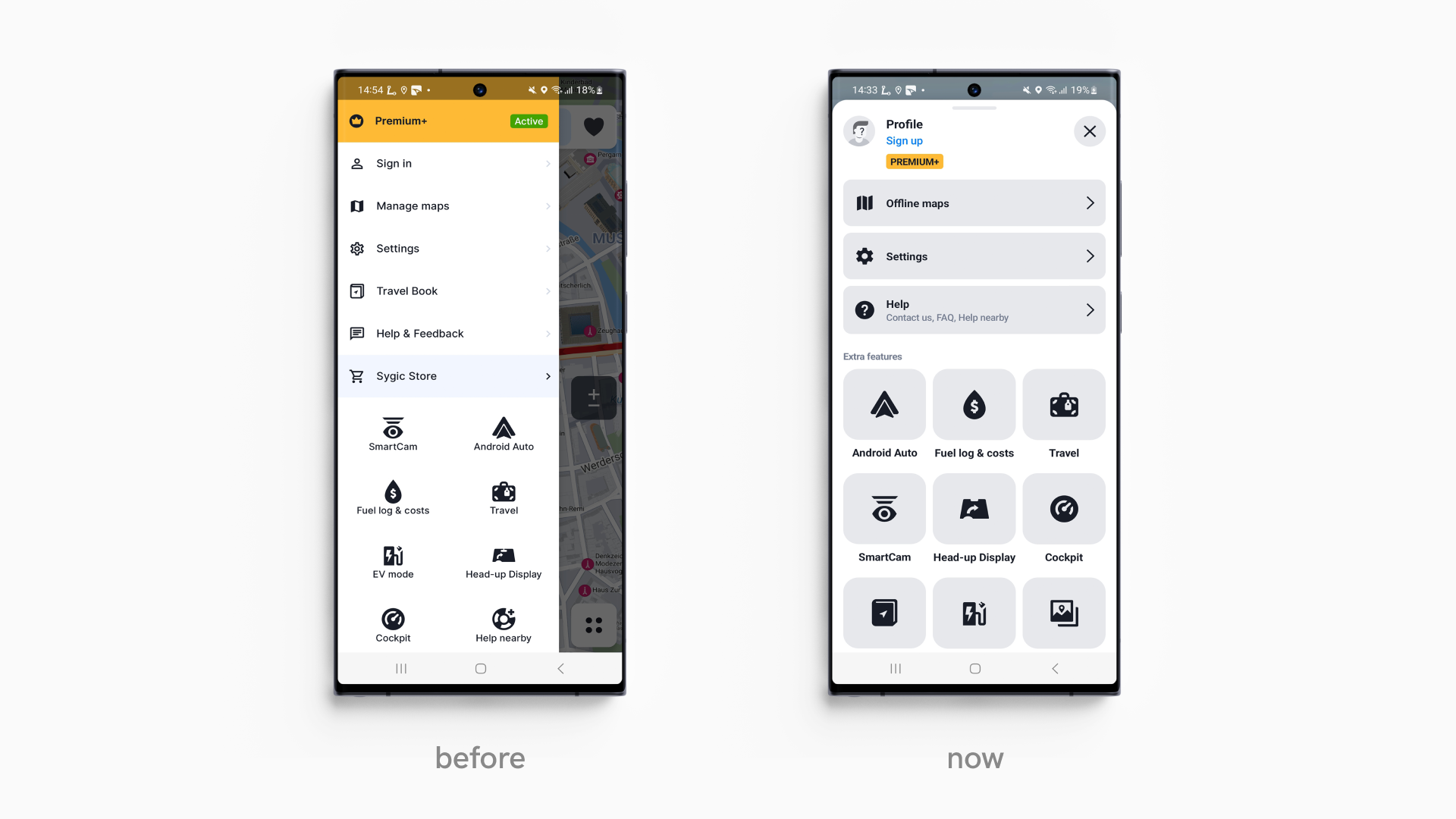
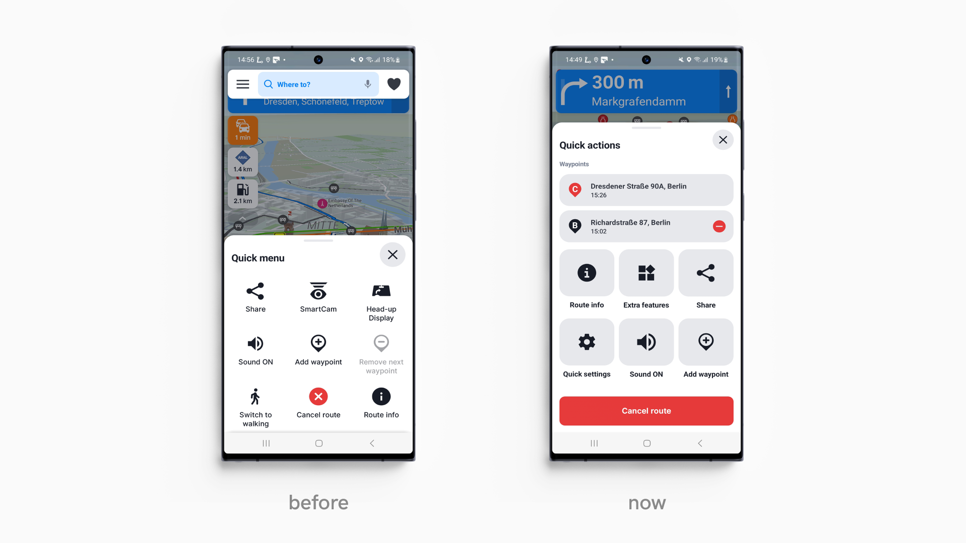
A redesigned menu now occupies the screen width, consolidating all items into one easily accessible location and eliminating duplications. This menu structure is poised to provide expanded content for drivers in the future.
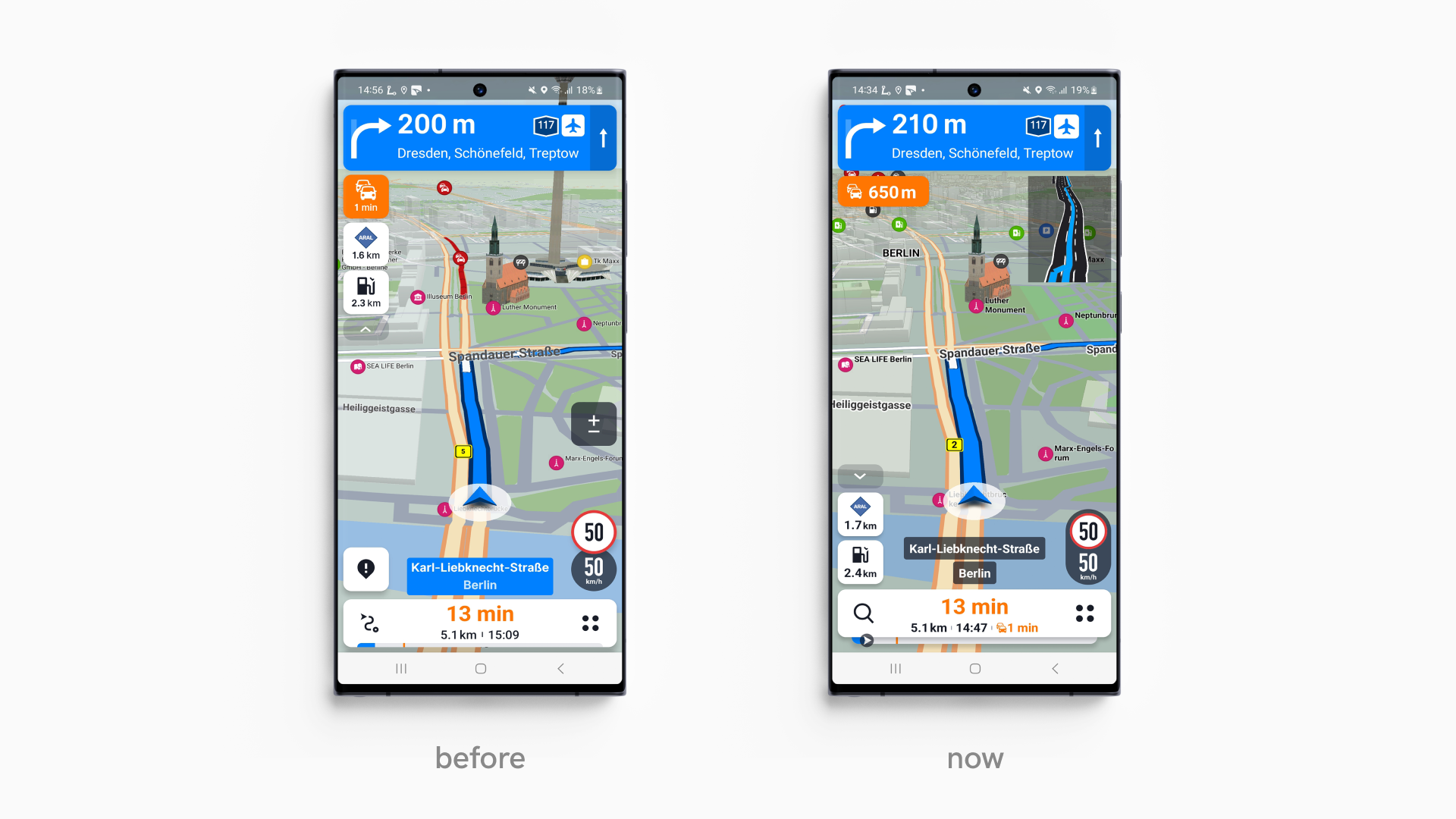
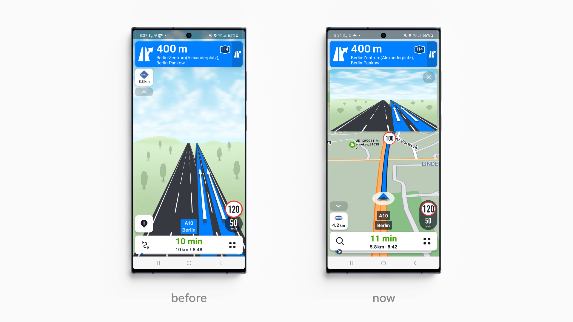
Several elements have received a refreshed appearance in navigation mode, enhancing clarity. For instance, the speed limit information bubble boasts a new shape and improved contrast, while warnings and delays feature more prominent and eye-catching labels beneath the top blue signpost.
At the bottom of the screen, an informative bar displays the remaining time and distance to the destination, along with anticipated minutes of delay. A revamped progress bar directly below features a blue arrow, providing real-time tracking of the current position on the route. Colored slots within the progress bar alert users to traffic delays ahead, ensuring they stay informed throughout their journey.
While driving, four dots on the right side of the info bar conceal a quick menu, simplifying route management by enabling the effortless addition or skipping of waypoints. This feature also provides insights into the estimated arrival times at each waypoint and the final destination. For user convenience, all add-ons, such as EV mode, cockpit view, head-up display, and Help nearby, can be toggled on or off right here.
One of our most beloved features, Junction View, has undergone a sleek makeover. When approaching a crossroad, a lane-by-lane overview emerges in the upper half of the screen, ensuring the overall map and route remain visible to the driver.
Furthermore, a comprehensive font redesign across the entire app significantly improves readability. Both night and day modes sport fresh skins, and state borders have been highlighted in a distinct signal violet hue to enhance visibility.
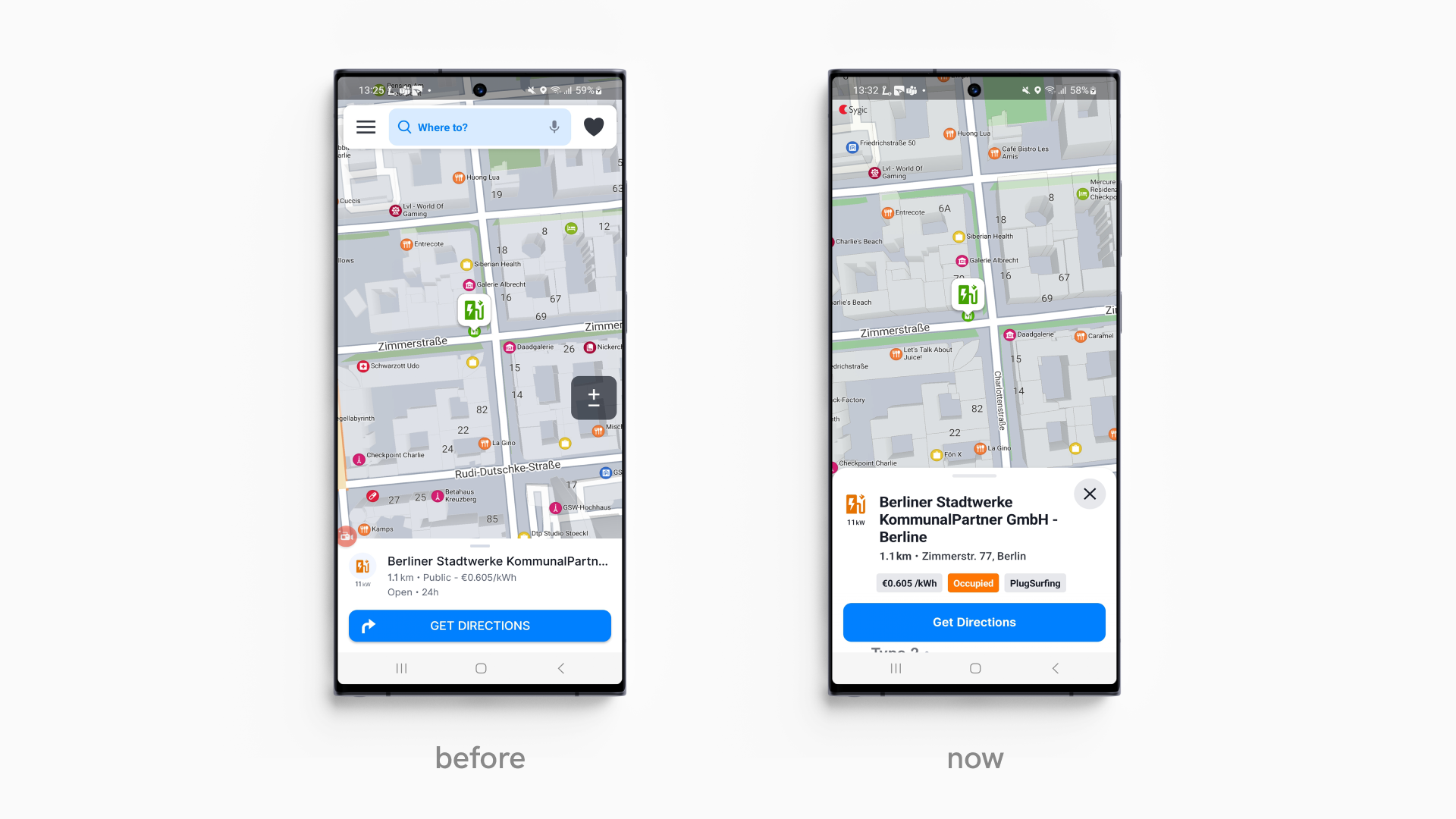
Tapping on points of interest on the map now reveals all pertinent details in neat ribbons. Driver can swiftly access current fuel prices and contact information at fuel stations. Charging points for EVs provide essential details on connector types, payment methods, and availability. As for shops and institutions, drivers find convenient contact information and website addresses for quick reference.